Careful Colors in Science Communication
By Trevor Harrison
I just spent four hours staring at color.
Not to decide on a new shade for my living room walls (they are a lovely blue). No, I’m trying to pick a color scheme for presenting my data. But why four hours? Isn’t that a little obsessive? Well, maybe. Because a well-crafted color set balances three critical factors — clear communication, accessibility, and aesthetics. Simultaneously achieving all three is not a simple task.
In daily life, color adds meaning to our trash cans, road signs, even Valentine’s day flowers. Maps have used color for centuries to indicate political boarders and terrain type. Using color, we encode the object with additional information — the double red line on a map, an interstate; the filled blue on Massachusetts, majority Democrat; the green on a garbage bin, compost (if you live in Seattle).
As an engineering PhD student, I communicate my research using words, tables, and figures. And personally, I try to match National Geographic: I want my figures telling most of the story. So it’s critical that those figures are quickly and accurately interpretable. Color plays a key role.
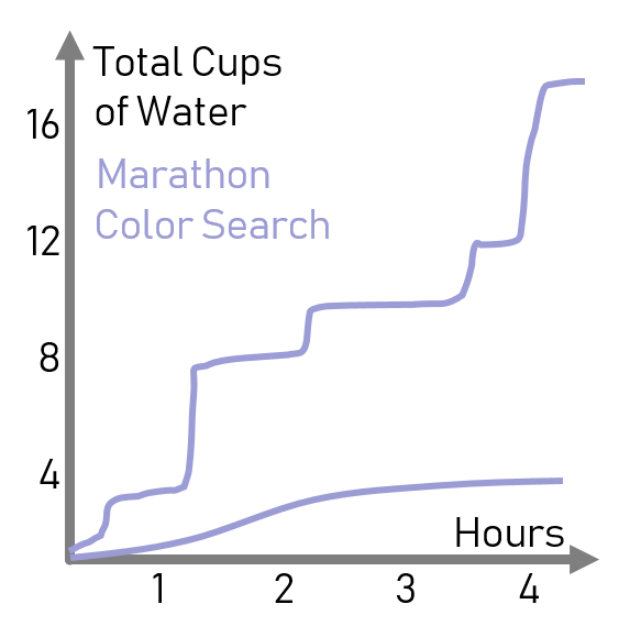
Clear communication requires the ability to clearly differentiate between elements pictured. Take for example, this plot of my water consumption when searching for colors versus my water consumption when running a marathon (this data is totally made-up).
The ability to clearly differentiate between elements pictured. Take for example, this plot of my water consumption when searching for colors versus my water consumption when running a marathon (this data is totally made-up).
Here, the colors distinguish the different time series: blue for marathon, pink for color searching.
However, if you’re a member of the 6% of the population with deuteranopia, the most common type of colorblindness, the plot looks like this:
Totally useless. You might guess that I’m thirstier running a marathon, but my beautifully chosen color scheme does nothing to communicate. A colorblind reader would be flummoxed (not to mention annoyed). Admittedly, a plot this simple can just use labels on the lines. But in my research figure, I have five different overlapping time series to distinguish, forcing my hand: a legend is necessary. By choosing my colors more carefully, I can ensure accessibility of my data.
Now admittedly, there are other ways of distinguishing lines. They can be dashed and dotted. They can be marked with different shapes. Supplement color with form. But this double-coding (two characteristics both adding the same information) feels clumsy and redundant, like drawing a picture of an apple and then adding the word ‘Apple’. Just not great design, not respectful of my reader’s intelligence.
Which brings us to aesthetics. The elegance of a well-crafted graphic – crisp, clear, dense, yet concise – it delights me. But creating those graphics takes time and attention to many other factors besides color: axes scales, fonts, formats, line widths.
Clear and accessible may take two hours, but from there to beautiful – I’m still on that journey.


